10 of November of 2024
Create Your First Dashboard: A Looker Studio Guide

Isaac Correa
Looker Studio Templates
Data Integration & Sources

Beginner’s guide to Looker Studio. Learn to create valuable dashboards that impress clients with clear data visualization
Looker Studio for Beginners: Everything You Need to Know to Create Your First Dashboard
Are you new to Looker Studio? No worries! This beginner-friendly guide will take you through everything you need to know to create a clear, valuable dashboard that impresses your clients.
From connecting data to adding visuals, this tutorial will help you feel comfortable with Looker Studio—even if you’ve never used it before.
What is Looker Studio?
Looker Studio is a tool created by Google that helps you make interactive dashboards and reports.
With Looker Studio, you can connect to different data sources (like Google Analytics, Google Ads, or spreadsheets) and turn that data into clear, easy-to-understand visuals like charts and graphs. The goal? Make data accessible and engaging for everyone, including clients who may not be data experts.
Step 1: Setting Up Your First Dashboard
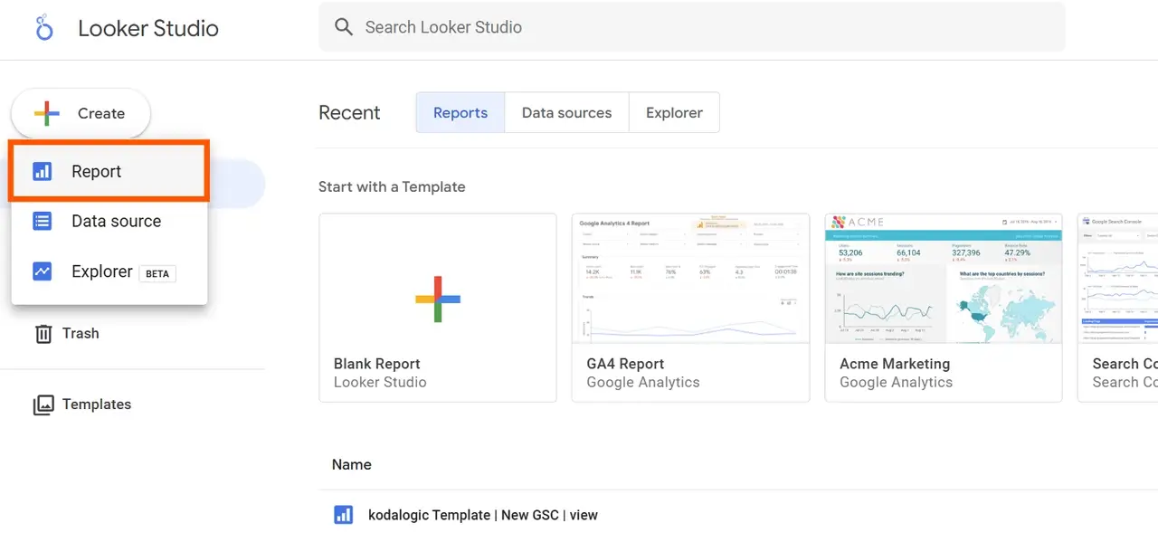
Let’s get started with creating a dashboard in Looker Studio. Follow these steps:
- Go to Looker Studio: Visit Looker Studio and log in using your Google account.
- Create a New Report:
- Once you’re on the main Looker Studio page, click on “+ Create” in the top-left corner and select “Report”. This will open a new, blank report where you can start designing your dashboard.
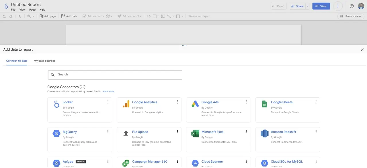
- Connect a Data Source:
- Looker Studio will prompt you to connect to a data source. This is where your data comes from (e.g., Google Analytics, Google Ads, Google Sheets).
- Choose the data source you want to use and follow the steps to allow Looker Studio to access that data.
Tip: For your first dashboard, you might want to start with Google Sheets (if you have a simple data table to work with), as it’s straightforward and easy to experiment with.
Practice with Google Analytics 4 Demo Accounts
If you'd like to practice before working with real client data, Google offers demo accounts for Google Analytics 4. These accounts provide real, anonymized data, making them perfect for testing Looker Studio’s features and creating dashboards with reliable sample data.
Available Demo Accounts:
- Google Merchandise Store (web data): Access this account here.
- Flood-It! (app and web data): Access this account here.
These demo accounts allow you to explore different metrics, experiment with data sources, and practice visualizations—all with sample data structured like real-world analytics.
Step 2: Getting Familiar with Looker Studio’s Interface
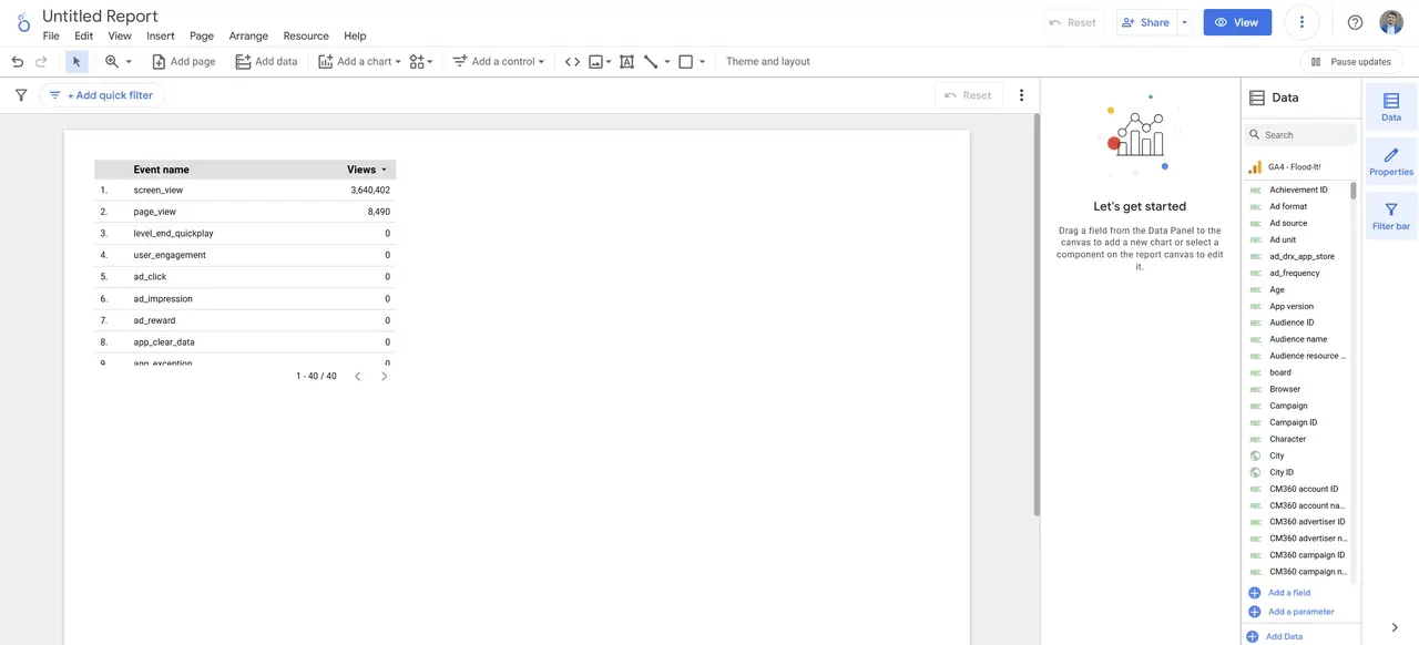
Before adding any data, it helps to know where things are in Looker Studio. Here’s a quick overview of the main areas:
| Section | Function |
|---|---|
| Toolbar | The top bar where you can add charts, tables, text, and more. |
| Sidebar | On the right side, where you find settings for pages, themes, and elements. |
| Canvas | The main area in the center where you’ll place and arrange your charts, tables, and visuals. |
| Data Panel | Shows the fields (data points) from the data source you connected; lets you pick what to display. |
Take a minute to explore these sections—getting comfortable with them will make building your dashboard much easier!
Step 3: Adding Charts and Visuals to Your Dashboard
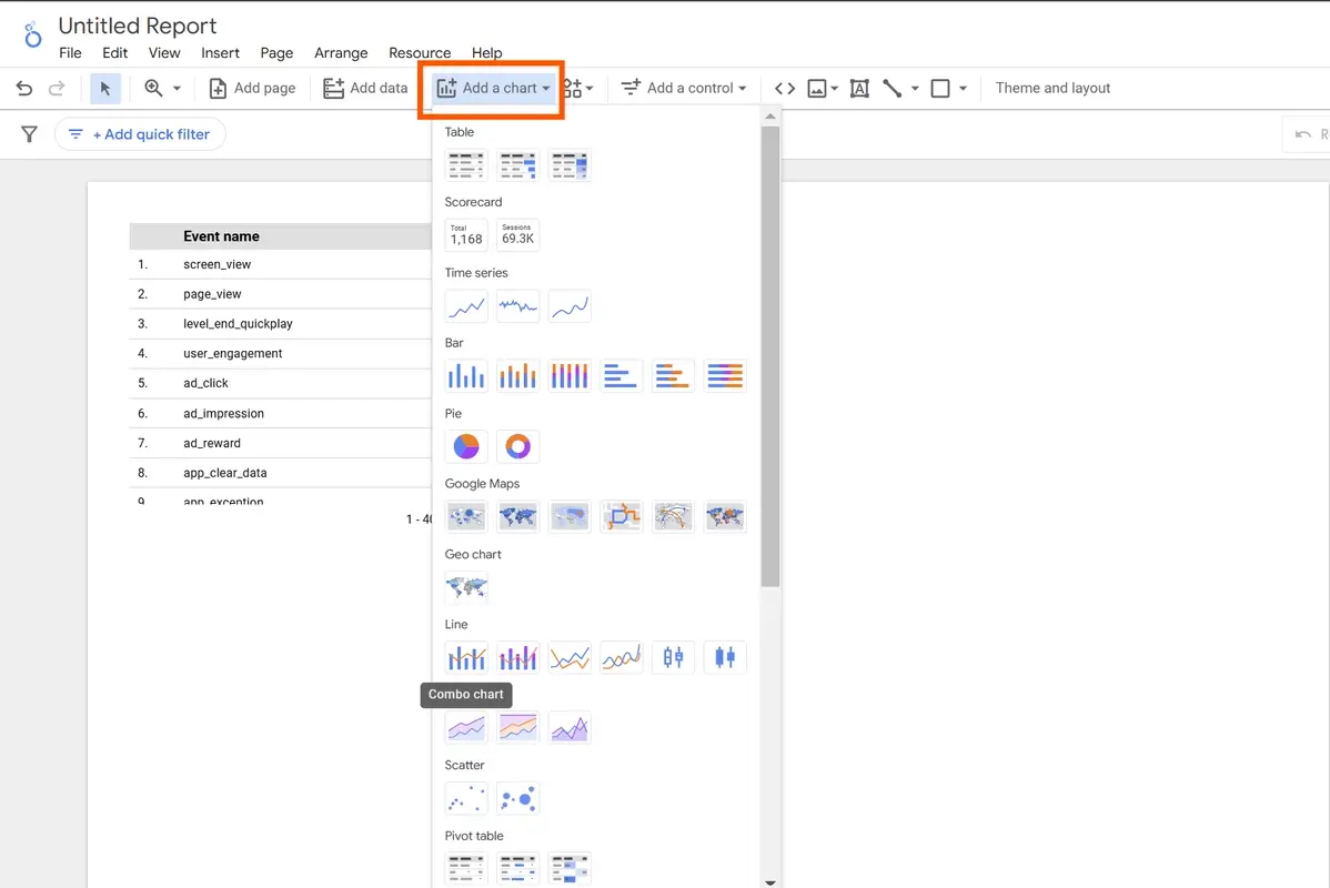
Looker Studio provides several ways to visualize data, from tables to charts. Here’s how to add some basic visuals:
- Add a Chart:
- Go to the Toolbar at the top, click on “Add a chart”, and select a chart type. Start with something simple like a Table or Bar Chart.
- Click on your chosen chart, and it will appear on the Canvas.
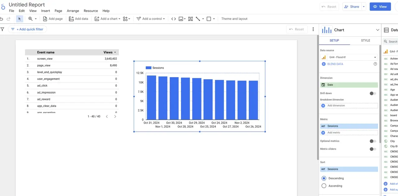
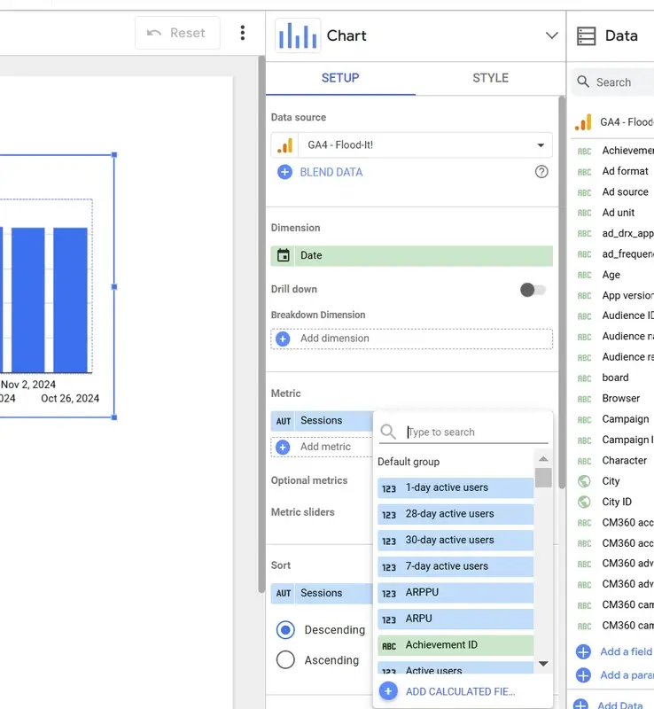
- Customize Your Chart:
- Select the chart you just added. In the Data Panel, you’ll see options to pick what data you want to show in the chart.
- Style Your Chart:
- Once you’ve added your data, go to the Style tab in the Sidebar.
- Here, you can adjust colors, fonts, and other design elements to make the chart match your brand or your client’s style.
| Chart Type | When to Use It |
|---|---|
| Table | To show lists of data, like a ranking of pages by traffic. |
| Bar Chart | Great for comparing categories, like traffic by device. |
| Line Chart | Ideal for trends over time, such as weekly user growth. |
| Map | Perfect for showing data by location, like user regions. |
Step 4: Customizing the Look and Feel of Your Dashboard
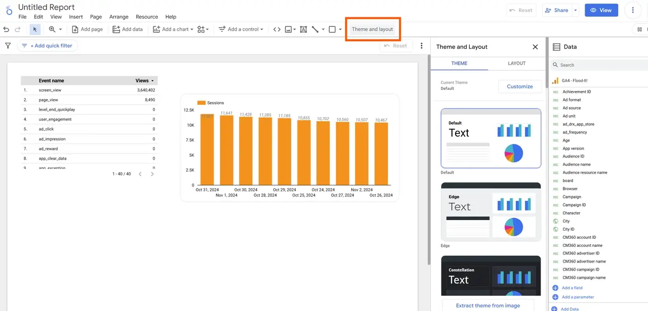
To make your dashboard look polished and aligned with your or your client’s brand, follow these customization steps:
- Open the Theme and Layout Settings:
- Click on “Theme and Layout” in the Sidebar on the right. This will open a menu with options for colors, fonts, and background styles.
- Choose Colors:
- In the “Component Background” option, set the main color for the dashboard’s background. This is the color that will appear across your dashboard.
- Select Colors for Charts and Text: Scroll down to adjust the colors for charts, labels, and text. Choose colors that match the client’s brand.
- Avoid White Backgrounds:
- Using white for backgrounds might make text harder to read. Instead, try light shades of the brand’s main color to keep text visible.
| Element | Suggested Color Choice |
|---|---|
| Background | Light, neutral colors that make data stand out |
| Text and Labels | Dark colors for readability |
| Charts | Brand colors for consistency and visual appeal |
Tip: Kodalogic templates simplify this process, providing preset color themes that you can quickly adapt.
Step 5: Adding Filters and Date Controls for Interactivity
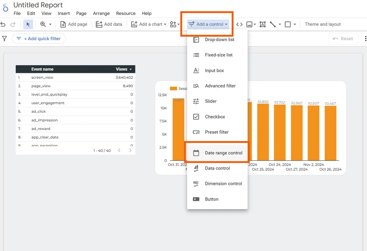
Making your dashboard interactive allows clients to filter and view data by their specific needs:
- Add a Date Filter:
- In the Toolbar, click “Add a control” and choose “Date Range Control”. This lets users pick a date range to analyze.
- Add a Data Filter:
- Go back to “Add a control” and select “Filter”. This can be set to allow users to filter data by things like location, device, or category.
| Control Type | Purpose |
|---|---|
| Date Range Control | Allows users to select different time frames |
| Filter Control | Lets users view specific segments of data (e.g., by device) |
These controls make the dashboard more user-friendly, enabling clients to dive deeper into the data.
Step 6: Sharing Your Dashboard with Others
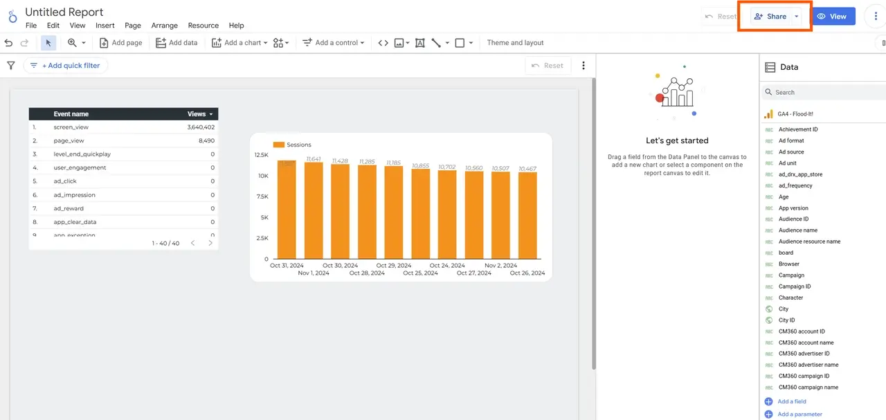
Once your dashboard is ready, you’ll want to share it with your client or team. Looker Studio makes this simple:
-
Click on “Share”:
- In the upper-right corner, select “Share”.
- You can give people permission to view or edit the dashboard.
-
Schedule Automatic Email Delivery:
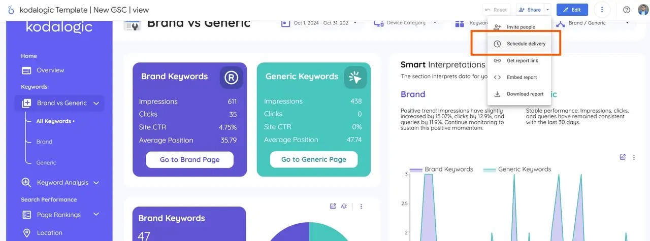
- You can set up automatic email deliveries so your clients receive the latest reports on a weekly or monthly basis.
- Choose the schedule that works best for your client and add their email to the delivery list.
Want a Professional Dashboard Faster? Try Kodalogic Templates
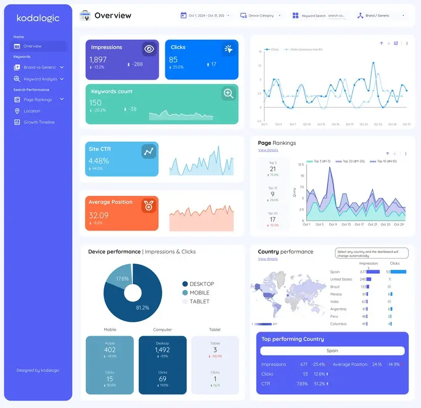
Creating a custom, professional dashboard that meets your needs can take time and effort. Sometimes, the best option is to use ready-made templates that are already optimized for the data sources you need.
Templates can save you time, improve efficiency, and prevent headaches—especially if you’re new to Looker Studio.
That’s where we come in! At Kodalogic, we specialize in creating templates for the most popular data sources, designed for users who want to get started quickly but don’t have the time to build reports from scratch. Our templates offer the quality and customization you need to impress clients without the hassle.
Explore our templates here: Kodalogic Templates
Helpful Tips for Your First Looker Studio Dashboard
- Keep it Simple: Don’t overload the dashboard with too many charts—focus on what’s most relevant.
- Define Your Goal: Know what your client needs to see; this will help you choose the right data and visuals.
- Test for Readability: Make sure everything is easy to read and looks good on different devices (like phones and tablets).
Conclusion: Create Meaningful Dashboards with Looker Studio
By following these steps, you’ll be able to create a polished, professional dashboard in Looker Studio that helps clients understand their data clearly. With a bit of practice, your dashboards will not only inform but also impress, strengthening your client relationships and showcasing your data skills.